A blog of my digital camera exploits

Sunday, August 7, 2011

Photos From Hawaii

--== This Blog Has Moved!! ==--
Check out my new blog, I AM Zech.

Not too long ago, I took a vacation to Hawaii. I had just gotten a 8mm super fish eye, and was looking to take a whole bunch of pictures. I ended up taking close to a thousand. I was planning on taking some cool time lapses, but I forgot to pack a tripod, so didn't get any of those.

Here is the link to my facebook album, which should let you look at them, even if you'r not my friend. Please make any comments here on the blog, and keep in mind that I don't accept friend requests from people I don't know.

http://www.facebook.com/media/set/?set=a.10150749113165305.715829.782240304&type=1

Tuesday, May 24, 2011

Madrid Williams Media

--== This Blog Has Moved!! ==--
Check out my new blog, I AM Zech.

I'm excited to announce that I have joined forces with a fantastic editor and digital cinema enthusiast, Jonathan Madrid. To take our work to a more professional level, we have started our own media company, called Madrid Williams Media. I built the logo and the website.

If you are in the Colorado Springs area and looking for affordable, profesional video production then drop us a line at www.MadridWilliamsMedia.com

Monday, May 9, 2011

Headlight Art

--== This Blog Has Moved!! ==--
Check out my new blog, I AM Zech.

Glowing Flower
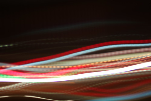
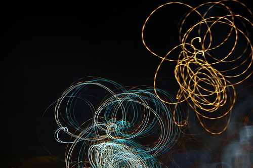
One of my favorite things to do on a long car ride, while someone else is driving of course, is to take long exposures of the street lights and headlights around me. By doing long exposures, anywhere between 10 and 30 seconds, and moving the camera around and adjusting focus, I can get some great looking abstract photos.
I hope you enjoy these photos that I took Saturday night on the ride back from my brother Jeremiah's graduation party. Congratulations to him for graduating from CU- Boulder!

--Click to view full size--
light wall
Streetlight River
Bright Hook
Bright Basket
Neon Highway

Thursday, May 5, 2011

Using the "Sunny 16" rule to plan a shoot.

--== This Blog Has Moved!! ==--
Check out my new blog, I AM Zech.

Tomorrow my older brother is graduating college, and I want to be able to capture photos of him getting his diploma so I went to grab my longest lenses, one is 500mm prime and the other is a 70-300mm zoom. As not to look like the awkward photographer, I decided to just take one. But which one?

The 500mm prime has a much sharper image and longer length, but it only opens to f/8 whereas the zoom opens to f/4, two whole stops. I decided to take the 500mm as long as I could get enough light.

The "Sunny 16" rule states that on a day with direct sunlight, set the f-stop to 16 and the shutter speed to reciprocal of the ISO. There is another rule that states, don't ever shoot at a shutter speed less than your focal length.

Knowing all of this I know ill set my f-stop to f/16, my shutter speed to 1/500s and my ISO to 500. With these settings I know I can get a properly exposed shot that's not gonna be blurry and not too noisy (I know photos look good up to 800 ISO and I can get away with 1600 ISO).

But what if I want a lower ISO for a cleaner picture? Well since the minimum f-stop of the less is f/8, I know I can, but how much more?

All I have to do is know stops. Stops are units of exposure which you can translate into any of your three exposure options. To add or subtract a stop from ISO simply double or half it, and the opposite is true for shutter speed. To do the same for f-stop, its 2 stops for each time you double or half it.

So going from f/16 to f/8 is two stops, and knowing ill stay at 1/500s, I can half my ISO twice, giving me 125. Which means ill be able to get a low ISO shot if I want.

Needless to say I packed the 500mm prime and will be taking pictures in the morning.

Tuesday, May 3, 2011

Using Technicolor's LUT file WITH LUT Buddy

--== This Blog Has Moved!! ==--
Check out my new blog, I AM Zech.

--Update: Technicolor took town the LUT file and replaced it with a .mga file. This should work just the same in LUT buddy without the "changing Pattern" workaround.--
Yesterday I covered how to use a LUT file without any plugins, but was informed that some editors don't have support for custom curves. So I downloaded a trial of Premiere, since I don't have a Mac, I cant test Final Cut, and fiddled around with LUT Buddy till it worked. The secret? Upload your LUT file in setup, then change the "Action" to "Draw Pattern", then the "Pattern" to "3D 64", and then the "Action" back to "Apply LUT". And that's it!

Here is my quick video tutorial showing how to do it in Premiere, but hopefully it works the same in Final Cut:


The only change I would make is putting the LUT file somewhere in the Adobe directory, or other location you know will continue to be around, instead of with the project files so it doesn't get deleted or lost when you move on to another project.

Monday, May 2, 2011

Using Technicolor's LUT file without a LUT plugin

--== This Blog Has Moved!! ==--
Check out my new blog, I AM Zech.

<span class=


Using the LUT file provided with Technicolor's CineStyle picture profile is essential, but some editors, including Sony Vegas, don't have a plugin for LUT files.
Here is a video tutorial that I made explaining how to use the LUT file without a plugin.


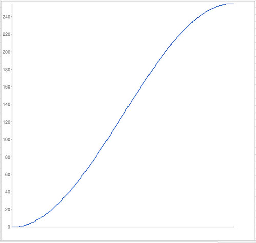
This is the graph of the curve defined by the LUT file. Reproducing this replaces the need for a LUT plugin.
<span class=
And don't forget to save it as a preset for later use.

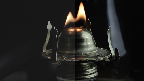
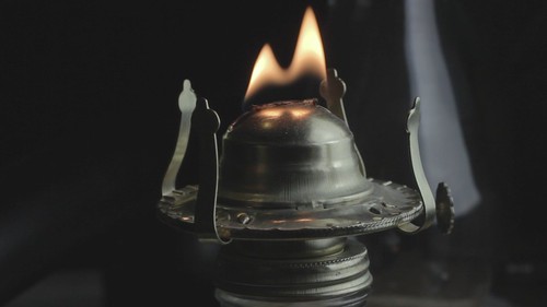
Here is the image before and after the LUT defined s-curve. Click for full size.
<span class=

<span class=

Saturday, April 30, 2011

Technicolor CineStyle vs. SuperFlat vs. MarvelCine vs. Neutral

--== This Blog Has Moved!! ==--
Check out my new blog, I AM Zech.

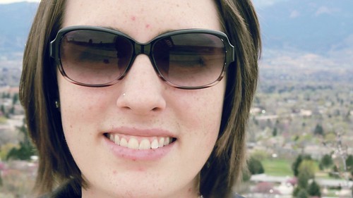
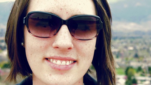
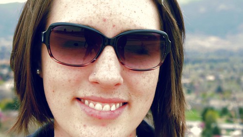
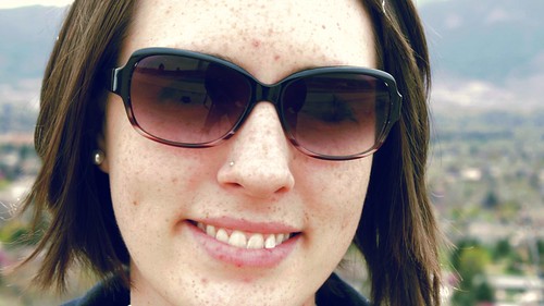
After the popularity of yesterday's post, I decided to continue my tests of grading Technicolor's new picture profile CineStyle. This time I took my beautiful girlfriend and we headed out to get some skin tone tests.
I set up one scene, which I shot at proper exposure and then overexposed.
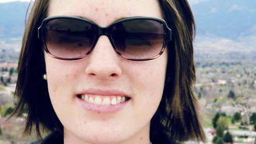
Since some people asked for comparisons, I shot in what I believe to be the most common picture profiles: Neutral, MarvelCine, SuperFlat, and of course CineStyle. All styles were set to (0, -4, -2, 0)
I brought them back and ran quick color correction over them, focusing on getting them as close as possible, without deviating too far from a basic correction.
--Click images for full sized versions--

Neutral:

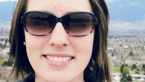
MarvelCine:

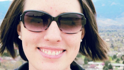
SuperFlat:

CineStyle:

As you can see, they're all very similar, but the MarvelCine and Neutral came off the camera looking more graded, and they were the most difficult to push to something new. The SuperFlat and CineStyle both kept the most details in the shadows(look at the sunglasses, in Neutral you can barely see her eyes), but CineStyle kept the most detail in the highlights (look at her teeth). I did not like the way SuperFlat held the color in her cheeks. It looks unnatural to me.

If I were to rank this round, it would go as follows:
1st to Cinestyle for keeping detail in her eyes and her teeth, and keeping natural color. Plus it was easiest to grade.
2nd to MarvelCine because it has a wide dynamic range, and also kept the color nicely.
3rd to Neutral because although it had a lower dynamic range, it had great color and was easy to grade.
4th to SuperFlat, because even though it has a wide dynamic range, but didn't produce usable colors without extra tweaking. Plus it was difficult to grade to a natural looking image.

Next I shot overexposed. I kept all of the grading the same, and only tweaked curves using the waveform to create the best image. The over exposed frame grabs strait out of the camera can be found at http://www.flickr.com/photos/zechw.
Here are the images corrected and graded:

Neutral:

MarvelCine:

SuperFlat:

CineStyle:

Once again, all the images look very similar, but when looking at her forehead, which was clipping, we can tell how graceful each of the picture styles handle overexposure. Again MarvelCine and Neutral performed almost identical, they even both added more red to her hair. But when it came to grading, I had to fight the graded look that it already had to produce a good looking image. Once again SuperFlat distorted its colors and took some extra work to bring skin tones back into an acceptable range (they were greatly over saturated). Also is it just me, or does her hair look softer with SuperFlat. CineStyle was easiest to grade and held its colors nicely.
This round goes to Neutral simply because her forehead looked better and its dynamic range was comparable to both MarvelCine and CineStyle. Next comes CineStyle because of its ease of grading, followed by MarvelCine. SuperFlat came in last because it did not produce usable colors without extra work.

Before CineStyle was released, I used to prefer SuperFlat when I needed the dynamic range and Neutral when I didn't, but now I will most likely be using CineStyle all the time because not only does it have the raised dynamic range, It is extremely flexible in grading. I feel like I could push CineStyle much more than I could Push Neutral or MarvelCine.

Friday, April 29, 2011

New Picture Style from Technicolor

--== This Blog Has Moved!! ==--
Check out my new blog, I AM Zech.


--Update--
Click images to see full quality versions

Today, Technicolor publicly released their much anticipated "CineStyle" for canon cameras. This new style supposedly replaces the inefficient rec. 790 capture with a more efficient LogC pattern. To see the difference check out this video or read up on rec. 790 here.

Although this is optimized for the 5D and many other bloggers will probably do the same thing, I decided to see how it performed on the T2i. I usually use the Superflat picture style on my T2i and since I have gotten the best results with that I decided to compare to Superflat instead of any of the ones built into the T2i.

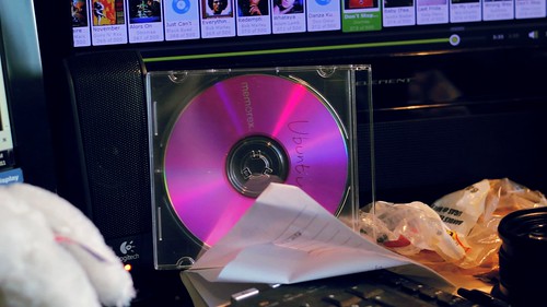
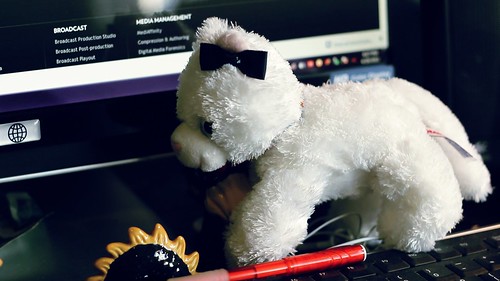
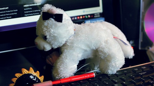
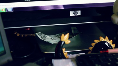
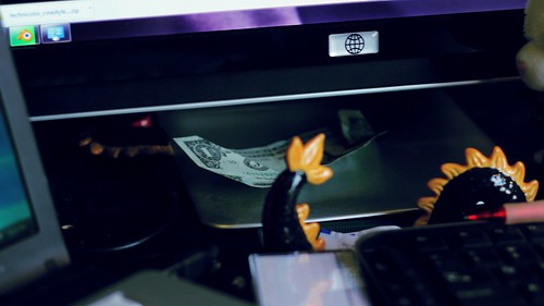
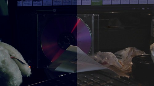
For my tests I set up two scenes. The first one consisted of random things on my desk: A CD, a stuffed cat that my amazing girlfriend got for me, a ceramic dragon, a dollar bill, and whatever else happened to already be there.

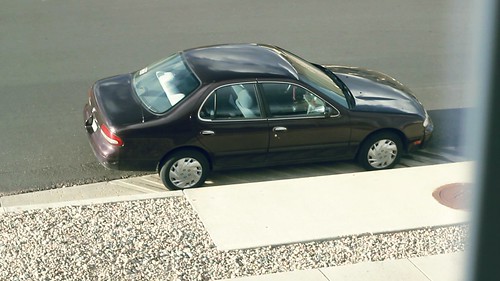
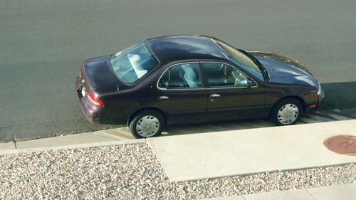
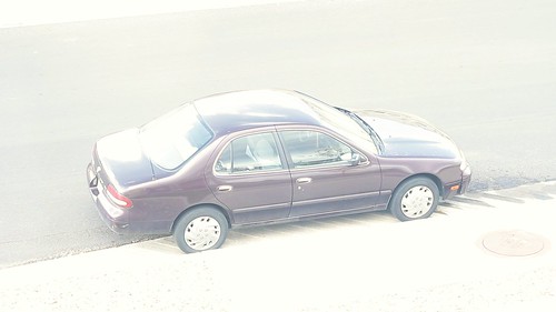
The second scene was out my window which was a view of my car.

It was all shot using a 50mm f/1.8 and exposure was kept the same for each shot. Color correction was my generic settings, tweaked very slightly to accommodate for differences in dynamic range.

All of this consisted of video, which still frames were pulled out of.

Click images for full sized versions

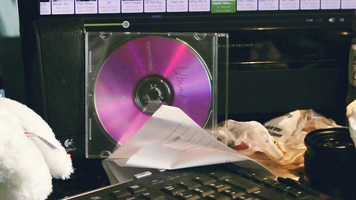
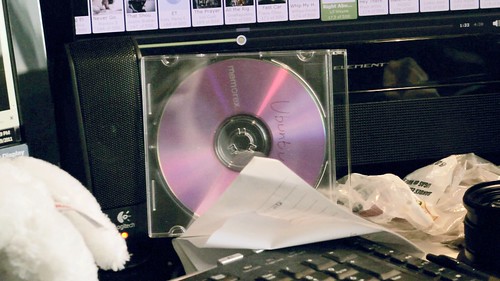
First up is the CD:
Technicolor Cinestyle:
Cinestyle CD

Superflat:
Superflat CD

The stuffed animal:
Technicolor Cinestyle:
Cinestyle stuffed

Superflat:
Superflat stuffed

The dragon and dollar:
Technicolor Cinestyle:
Cinestyle dollar

Superflat:
Superflat dollar

And my car:

TechnicolorCinestyle:

Cinestyle car

Superflat:
Superflat car


As you can see there is little to no difference between the two, except a little extra "punchyness" in the dollar bill and the car with Cinestyle and Superflat produced a softer image, although all the settings were
identical. So I decided to push the picture profile to its limits, the curse of any HDSLR... Over exposure and under exposure.

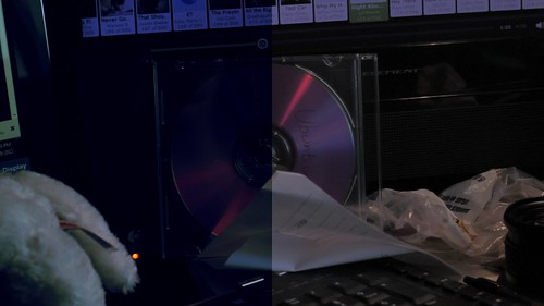
First under exposure. For this I ran the images through my standard color correction settings as before, but due to the added contrast just making everything too dark to see anything, I cut out half of the frame to be un-color-corrected. Then I tweaked curves to get the best possible image with proper exposure. Since they were generally all the same, I've only included the CD, which was most telling.

The CD:

Technicolor Cinestyle:

Cinestyle CD under

Superflat:
Superflat CD under /></span></div></div><div style=

The CD corrected:
Technicolor Cinestyle:
Cinestyle CD corrected

Superflat:
Superflat CD corrected


We can see that the Technicolor Cinestyle has more detail in the shadows on the unprocessed image. Also looking at the corrected images, the Cinestyle held its color better and has less noise (look at the black bar on the very left of the frame.)
Finally I shot video of my car overexposed and corrected exposure using curves.

My car overexposed:

Technicolor Cinestyle:

Cinestyle car overexposed


Superflat:
Superflat car overexposed

And my car corrected:

Technicolor Cinestyle:

Cinestyle car corrected

Superflat:
Superflat car corrected


This test is most telling. When overexposed, the Superflat lost all sharpness, but the Technicolor Cinestyle not only kept all sharpness, it kept all its color as well and actually produced a usable image.

Saturday, April 16, 2011

Why I love DSLR's

--== This Blog Has Moved!! ==--
Check out my new blog, I AM Zech.

When I was in high school, I decided to get into photography and videography, so I saved up my money and bought a Nikon D90 DSLR and a Canon GL2. For the longest time I shot photos on the D90 and video on the GL2, and never thought of mixing it up.
Anyone who has ever used the "Photo Mode" on a video camera knows that the images that come out of it are completely useless, so when I read in the manual (yes, I read the manuals...) that the D90, a DSLR designed for taking photos, could take video, I assumed that the same would hold true as video camera stills, i.e. the video would be useless.
I don't think I've ever been more wrong.
Once I started playing with the video mode of the D90, I was amazed. Not only was it HD, but it was beautiful! albeit grainy and over compressed. After I saw the power of the HDSLR (HD video recording DSLR) I packed away my GL2 and haven't touched it since (which was getting outdated anyways).

There are three main reasons why I shoot exclusively on HDSLRs: Price, depth of field, and versatility.
First off price. A new professional/prosumer video camera costs run into the thousands, not to mention another few thousand for a depth of field adapter and lenses if you want the cinema look. A new T2i, which is what I currently shoot on, is under $800, and comes with a lens, although its about the bottom of the bucket when it comes to lenses.
The next reason why HDSLRs are so powerful are because of the depth of field that is created with their larger sensors. Depth of field is when the background and foreground of an image can be thrown out of focus, or blurry, and the subject can remain sharp and in focus. This allows for more artistic options and a more cinematic look. With a standard video camera, a depth of field adapter is needed to get the same shallow depth of field, which can get pricey and degrades the image.
The final and biggest reason that I love HDSLRs is their versatility. It succeeds in both worlds, as a high quality video camera and as an amazing stills camera too. This morning when I was shooting the promotional video for Frontline Church Planting Center, Alan asked me if I could snag a few head shots of him. If I were shooting on a standard video camera, he would have been out of luck, but since I had my T2i, I simply unplugged the microphone, slapped on a speed light, and I had them done in no time at all. This could be a fantastic way to up sell to clients. No longer do I have two separate setups, one for video and another for stills, I'm always ready for whichever one they want. When I went on the winter retreat back in January, I shot an entire videos worth and a photo albums worth without having to bring more than a shoulder bag.
No one knows what type of cameras we will be using in the future, but I can see myself using a HDSLR for a long time to come.

Shot List 4/16

--== This Blog Has Moved!! ==--
Check out my new blog, I AM Zech.

I decided to start a reoccurring post titled "Shot List"
This will be an update on what I'm planning and doing.

On Tuesday I got a call in the middle of my Jazz History class to go shoot a missions trip promo. Being excited to shoot anything, I quickly grabbed all my gear and headed over to Vanguard where I met up with Dan, Roxanne, Adam, Kimberly, David, and Danny.
We shot three people, Adam, David, and Roxanne, talking about what the mission trip is and why people should go. We also shot a short with Kimberly texting Danny about the missions trip, that will be the intro to the video, then the interviews will run. This is going to be played in main service in a little over a week.
On this shoot I decided to try using the superflat picture profile, and although it looks bland on screen, when I brought the footage back and did some preliminary grading, it was a dream come true. Yes, the blacks have just a touch of noise, but the noise almost looks organic and natural, plus the blacks have noise in pretty much any picture profile.

Today, Ill be transcoding the footage from Tuesdays shoot and also shooting a promo video for Frontline Church Planting Center downtown. More information about them can be found at http://www.frontlinechurchplanting.com/
I'm not entirely sure what to expect from this shoot. I plan on using superflat again for sure, but other than that, I have a lot of new gear to play with: a new fluid head tripod, a shoulder mount and an eyepiece loupe.
I'm considering shooting this in cropped CinemaScope, which would be my first time using it for an actual piece.

After I get back from that its edit as much as I can, to cut a new announcement video, since one didn't get shown last week and we never shot one this week, and the other projects I've already mentioned.

Friday, April 8, 2011

DIY Projector Screen

--== This Blog Has Moved!! ==--
Check out my new blog, I AM Zech.


A couple of weeks ago I saw someone getting ready to throw away a projector. Being cheap, I quickly stopped them and asked them if I could have it. In the weeks following, I have disassembled and resembled it about three times to make it work better. when I got it the image was very weak and horridly spotted purple and green.
Who Cares! I have a five foot screen!

The free projector... Quite a beast.

After lots of cleaning, the image is brighter, I can watch it comfortably at night, and the purple and green images are almost gone. Plus the image is clearer and sharper.
So to best view my new projector, I decided that I needed a screen. After looking around online for one, I noticed that they are pretty darn pricey, especially to pair with my free projector, so I decided to build my own. After looking around online for plans online, I couldn't find one that I liked.
The projector screen had to meet four criteria:
It had to be dirt cheap (not more than $20)
It had to be able to roll up for easy storage
It had to be able to be hung from the wall quickly and easily without damaging the wall
And it had to block out light from behind it, since I plan on hanging it over my window and want to use it during the day.

First I had to figure out what material to use. One black to block out light from behind and one white to display the image on. I decided on cotton bedsheets because they were cheap, $5 a sheet. Folding the sheets in half would give me a thicker sheet and almost perfect size for my screen. Then putting PVC pipes in the top and bottom would allow me to hang it and keep tension in the screen, with some wire out the edges and some Monkey Hooks in the wall. The pipe was just over a dollar for them both, and I already have some wire and the monkey hooks.
Its looking good for under 12 bucks!

The other day, with the help of my awesome Mom, I ironed all the wrinkles out of both sheets and she sewed the sheets in half, so they are two-ply. Now all we need to do is sew the two pieces together and the PVC pipes into the fabric, creating a nice looking black border, and hang it. Hopefully we'll work on that some more tonight.

Thursday, April 7, 2011

About Me

--== This Blog Has Moved!! ==--
Check out my new blog, I AM Zech.

What makes me different from all the other boring bloggers out there, I'm not a gifted writer or can sit down and just chug out a books worth of writing. I've never been the outgoing one to divulge all my personal information, in fact, I usually find it hard to introduce myself or talk about what makes me me. I never thought of myself as a blogger or someone who really had much to say, at least in typing out words on a screen (I haven't ever really felt a connection to the written word), but more and more I'm finding my passion. I'm cramming my head with as much knowledge as I can and its started to overflow so much that I can't not talk about it. as for my passion, my reason for existence, my only true calling on my life:
Digital filmmaking.

From a young age I always loved movies more than anything else. I was captivated by how they combined beautiful visuals with great story lines and wonderful acting, although when I was young, every movie was amazing, and I thought that they weren't actors, but just real people. A book was just boring words on a page. A song was just exciting to your ears. A picture was good to look at, but never drew me in as well as a movie could.

I always knew I wanted to work in movies, in some way or another. I've wanted to be an actor, an animator for animated films, or just working at a movie theater. I didn't care what I did, I just wanted it to have something to do with movies, and then I'd be happy. Sadly though, I am a realist. I looked at the chances of actually becoming an actor and decided it wasn't worth the risk, but it might make a good hobby. In fact all of my desire and passion for film turned into a hobby. This was around high school, when I needed to come up with what I wanted to study in college.

Ive always been gifted in many areas, and had a two-sided personality. In high school I excelled at math and science, and had a photograph that I took go to a few competitions. I had to decide what side of myself I would peruse as a career. Once again putting my passion as a hobby, I enrolled in mechanical engineering at UCCS. In my first semester I aced all my classes and got onto the Presidents List for academic achievement, but I knew inside that it wasn't what I really wanted to be doing. About a month into my second semester, I decided to be done with being logical and picking careers that I could be good at and make a lot of money, but ultimately not enjoy. When I went to my parents telling them that I was dropping out of an engineering program that I was acing to do general studies, they were hesitant, but after explaining how I felt and why I was in engineering in the first place, they understood. After a semester of random classes, I finally found my passion. I changed my major, this time to digital film making and am currently a sophomore, all thanks to one realization: I want to be a Cinematographer.

So how did I go about pursuing this? Well I stopped having a life. I have completely emerged myself in filmmaking in any way I can. I went out and blew my savings on a camera, and started shooting. I read countless film making blogs and watch hours of videos on it on Vimeo and YouTube, learning everything I can. I have been working as a freelance videographer and photographer. Of course, I had a regular job because, remember, I'm a realist, and video equipment isn't going to buy itself. This started as a crappy fast food job, but then became a staffed, part-time sports photographer, and now I'm doing digital media management and motion graphics and getting to shoot for work every now and then too.

I shot video a lot. On new years I made a resolution to do some kind of photo or video project every month, so far I have shattered that and have been doing around two every week! Its hard work and most of it isn't for pay, either just for fun or for my church, but it's been the most rewarding few months of my life. I'm excited to see where the rest of my life takes me, but I hope that I can share what I learn with anyone who wants to listen.